Figure 21
Figure 22
I spent a lot of space describing how to use neutral colors to eliminate color casts, but not all images need this! You need to do this when the tone of a picture needs to be warmer or colder to better coordinate with other pictures. For example, you need to increase the tan to exaggerate the sunset or afterglow on the lawn. . Adding a little red to the skin on your face, or removing some yellow from the image of the evening, is no problem for you. To increase or decrease the contrast similarly, you can do it with curves.
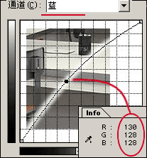
Find the source of the problem in the information panel and select the problematic channel in the curve dialog so that the problem can be eliminated quickly. When you move the mouse from the image window to the curve dialog, the message in the info panel disappears. If you change one or more points on the curve, then when the mouse returns to the image window, the difference between before and after the change is displayed in the information bar (Figure 23). Also, as we said before, holding down Ctrl clicks within the image allows you to determine the point on the curve. In color images, this feature is even more useful: if you are in a monochromatic channel, click on the placement point. It's fine; but if there are multiple channels, do you need to place multiple points? Repeated clicks on selected points in the image window are not a pleasant experience, and it is difficult to ensure that the same point is selected each time. At this point, the color sampler tool hidden under the eyedropper tool can help you a lot. Click on the image to place the reference point. The color information of the reference point with the label will appear in the information panel. Now refer to the value adjustment curve.
Figure 23
Keep sampling, remember the three straw tools we mentioned earlier? They allow you to set a specific color for the image under markup, which is very useful for images with special requirements. For example, if you want the brightness of the image to be 250, 250, 250 and 5, 5, 5, set the white and black straws separately. Combined with the neutral color we described earlier, you probably already know the grayscale. The role of straws. Most of the time, I prefer to use curves, but straws are also very handy tools. Sometimes I also use an automatic curve, which will make the darkest pixel in each channel black and the brightest pixel to be white. At some point this is good, but usually it will cause intense color and contrast . The preview window will reflect the changes to you. If you are not satisfied, hold down Alt and “Cancel†will become “Reset.†What are you worried about now?
We have seen so much about the entire image, but you sometimes have to look at when the curve is used in the local selection. Sometimes the foreground and background colors are not coordinated, and sometimes the background is too dark and the objects are just right...a lot of things have to be taken into account. After making adjustments to the image, we can also use the selection tool to select the selection area and use the curve to make local adjustments. The curve works in the constituency and in the channel.
Hand Crank Desk,Desktop,Crank Desk,Crank Desk Base
Electric Office Desk,Electric Desk Frame Co., Ltd. , http://www.nbofficedesk.com